
Newsletter
Newsletter
Two product leaders from the New York Times describe the strategy behind the biggest redesign of the company’s app since its 2008 launch.
16th May 2025
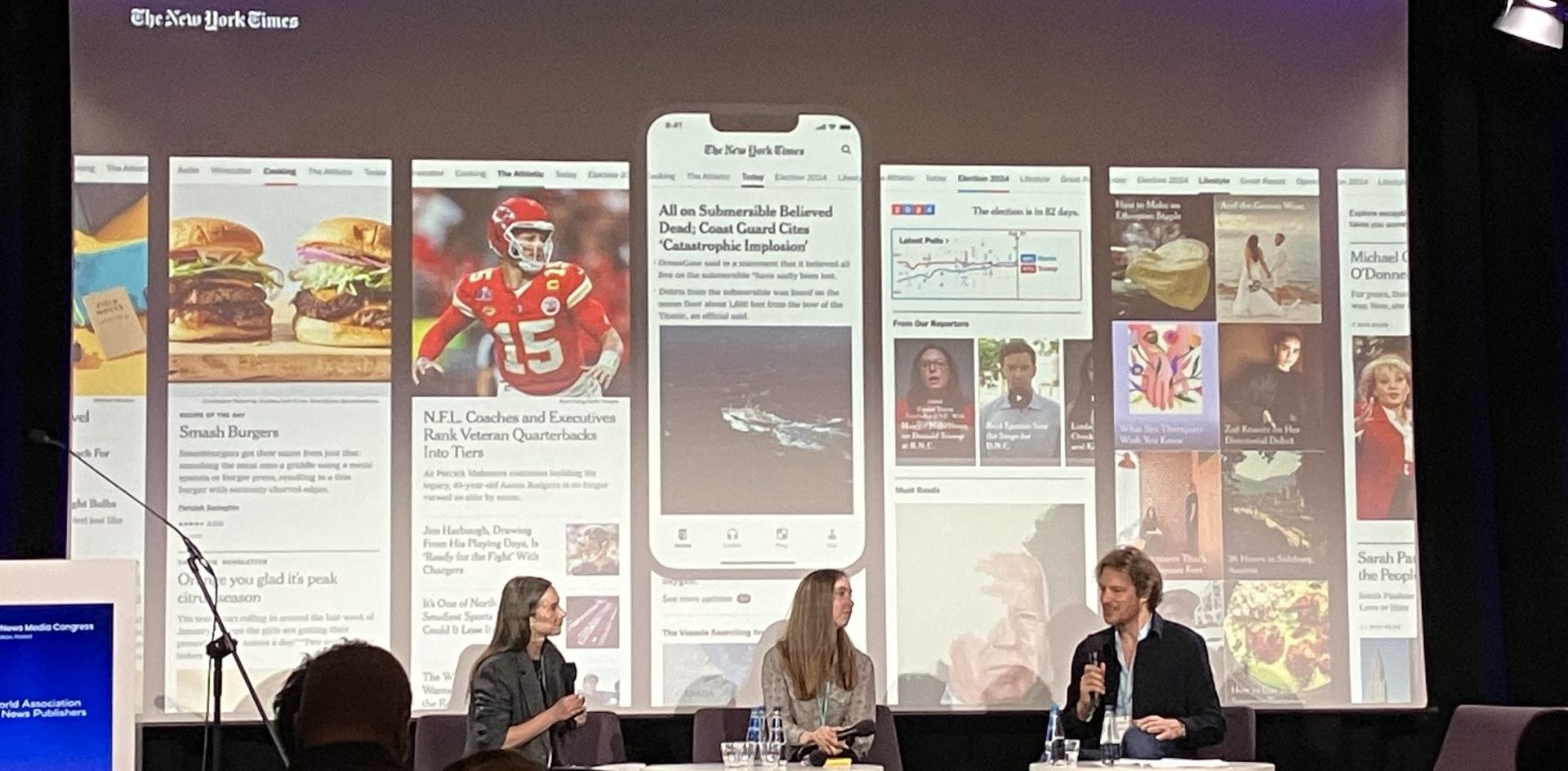
WAN-IFRA’s World News Media Congress 2025 provided a unique opportunity to hear the thinking behind the New York Times’ major redesign of its app, which was rolled out last year.
Emily Withrow, Vice President of Product and Head of Subscriber Experiences, and Kristen Dudish, Vice President of Product Design, explained the goals of the redesign and also how their approach continues to evolve based on data and user feedback.
Overall, the app was developed to strike a balance between several design, product and commercial goals.
While the app has been out for a while now, Emily and Kristen’s discussion offered a great opportunity to understand the thinking behind a major step-change in app design.
This is such a great window into deep product thinking about apps. If you want to discuss your app with our great product team, join Mobile Matters, our community for publishing professionals working with mobile products. You can read about it more on our Community Hub, and you can join here.
Kevin Anderson
By Kevin Anderson
They billed this as the biggest revamp of their app since the New York Times launched on the iPhone in July 2008, a year and a half after Apple’s device broke new ground.
Since 2008, not only has mobile technology changed dramatically, but so has the Times. It pivoted to a digital-first, subscription-first approach, and while journalism remains at its core, non-news verticals – Wirecutter’s reviews, games and cooking – have driven their growth for years. A third of its subscribers buy one of these non-news subscriptions even as the company works to upsell them to their premium, all-access digital bundle.
And the redesign of the app recognises the major shifts in the media market. “With the decline of (referrals from) search and social, a one-to-one relationship with our subscribers, with our readers, is paramount. We feel there is a ticking clock on our reliance on those platforms. Our response to the app plays a big role in that,” Emily said.
“When you download the app, you are more engaged. You are more likely to be retained. You spend more time with us. It is the best place to consume journalism,” she added.
The design of the new app strikes a balance between being a showcase of its flagship journalism while also providing a sampler of its non-news products using a new top navigation, which they call the ribbon. “We split the experience of the ribbon. Swipe right for the broadness of our signature journalism; swipe left for the broadness of our product portfolio,” Kristen Dudish, the vice president of product design, said.
The thought was to both allow users to dive more deeply into its journalism while also showing all of the value in their subscriptions.
The ribbon purposefully added some of the most popular content to the far ends – puzzles on the left and opinion on the right to encourage exploration. However, you can tell how important puzzles have become to their strategy, with navigation in the ribbon and the bottom navigation.
In the bottom navigation, they leaned into “modes” of content consumption, Kristen said. In the ribbon, the Times’ signature games are accessed via Puzzles, while in the bottom navigation, it is listed as Play. In the ribbon, users find podcasts and AI-voiced articles via Listen, while in the bottom navigation, similar content is accessed via Listen.
Throughout their discussion, they talked about the daily habits and rhythms of their audience, which synced up with this concept of modes.
“Games do lead to a daily routine. You wake up in the morning. You want to do a crossword or Wordle, and then, you have the top stories as well. They go hand in hand,” Emily said.
For audio, “if you want to listen to the New York Times during your commute in the morning, you can add Headlines or the Daily” to a playlist.
Considering different modes also flows down to different types of content. “For lifestyle in particular, we wanted a different, more visual lean-back experience” that contrasted from news, Kristen said, adding, “It lends itself to being more visual. They are testing looping video and image cards. “We are seeing people spend more time there like a social media feed,” she said.
One of the biggest changes in the bottom navigation is the You tab. “This personalises to your behaviour. We are constantly evolving this to make it smarter and smarter,” Kristen said.
Emily added, “We wanted to balance discovery with finding something to read or watch” based on their habits or the affinities that people have for specific sections, such as Modern Love or their favourite columnist. The app overall is designed to connect people to the larger universe of connect they produce, but Emily said: “We produce more than 300 articles a day. There is no way to programme that or provide pathways to that.”
As we pull together the research for our flagship State of Mobile Publishing report, once again, personalisation tops the list of innovation priorities for the publishers in our survey. It is the third report in a row that personalisation has been the main innovation focus, but this year, we added two choices: personalisation driven by users, what some publishers like The Atlantic refer to as customisation, and personalisation driven by AI, or algorithmic personalisation.
Like The Atlantic, the New York Times has worked to strike a balance between its own editorial curation and personalisation. The You tab adds a highly personalised, customisable experience in the app. Users are even prompted to add their name, which is displayed at the top of the You tab.
They also have personalisation in the Today feed, although it is an 80/20 split between editorial curation and personalisation. “We believe in our news judgment. We believe it is one of our biggest value propositions,” Emily said.
And they have been thoughtful in their approach in fine-tuning the algorithm so that “it is not based just on engagement,” she added. They also train the algorithm on editorial judgment. “We used the newsroom so that it is really represented in the algorithm.”
Usually with such a major re-design, “you see a hit (in use)”, Emily said, as users have to get used to new pathways to the content they most love. “You have changed people’s landscape,” she added.
However, the new app has been well-received. “We have maintained the baseline and just built from there,” she said.
Of course, they have had to make some course corrections. Through feedback channels and app reviews, users complained about sections that were moved. “We took a known pathway and moved that. We heard loudly that isn’t acceptable,” Emily said, so they added shortcuts.
In addition to user feedback, they have a suite of metrics they use to measure success, including app downloads, retention after download after the first week and first month, daily and monthly use and engaged clicks – clicks that lead to 30 seconds of engagement on a piece of content.
They segment their users between new, returningand dormant. They monitor these numbers on a weekly basis and run re-engagement campaigns for the dormant users.
They involved their readers along the way. “We did a lot of prototyping” and showed key elements to users. The app relaunch was also iterative, Kristen said, adding, “Everything didn’t launch all at once.”
They showed different versions of the ribbon to users, and Emily said, “We brought users along the way with almost every part we shipped.”
Here are some of the most important headlines about the business of news and publishing as well as strategies and tactics in product management, analytics and audience engagement.
Newsletter

Newsletter

Newsletter
Newsletter

Newsletter