Newsletter
Newsletter
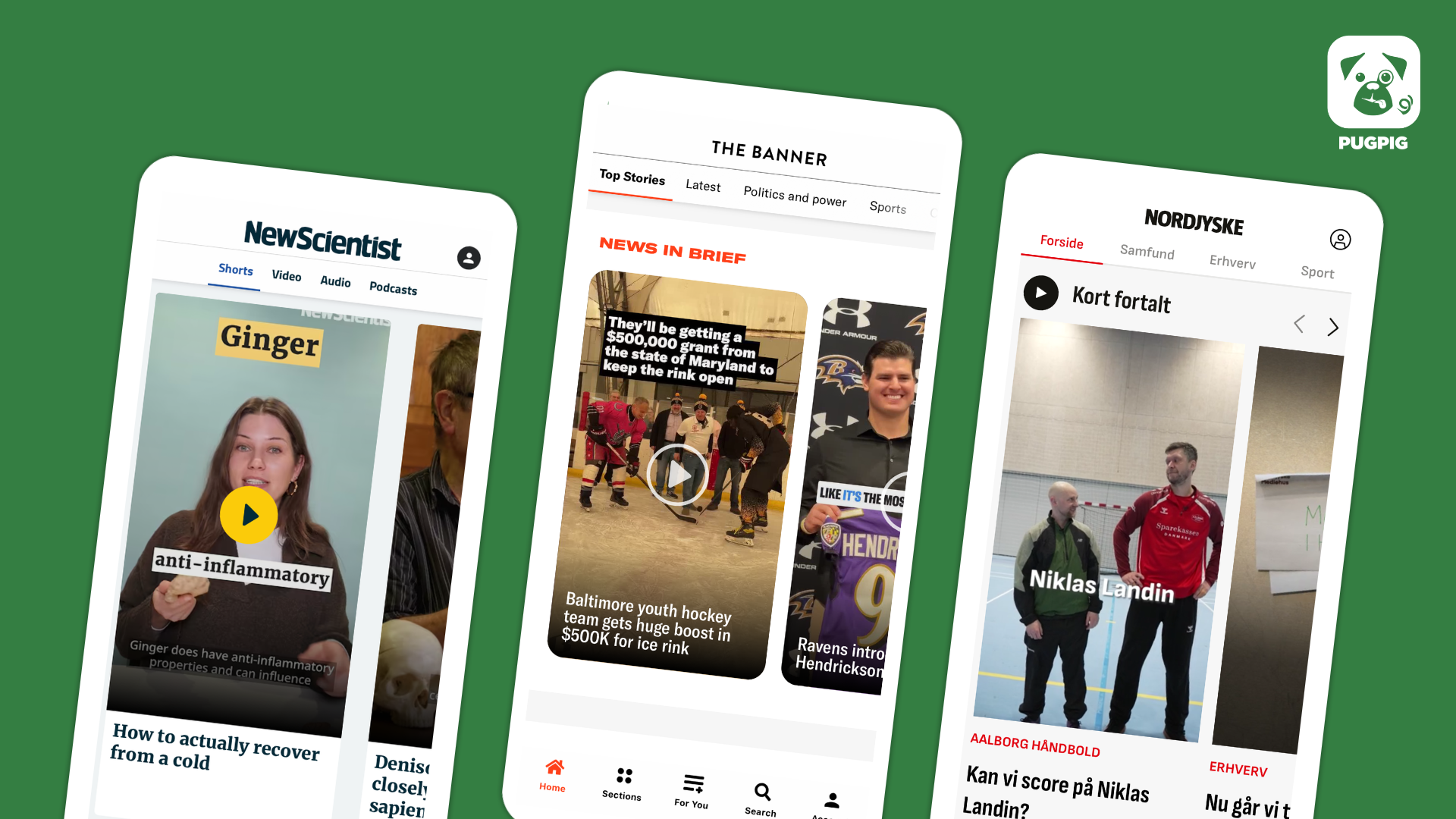
Personalisation and new designs are delivering vastly improved UX for publishers’ mobile audiences.
23rd May 2025
We’ll soon release our State of Mobile 2025 report, which combines proprietary Pugpig data with industry insights and input from a survey of media leaders to highlight the key trends shaping the publishing landscape. Through our regular conversations with publishers and the survey for the report, we’ve heard a recurring concern about the sharp decline in traffic, most notably from organic search. Publishers attributed this to Google’s algorithm updates and its introduction of AI summaries, which make it less likely that users will click through to the source.
How can publishers respond? As user acquisition through social and search has become more difficult, retaining and re-engaging existing audiences is more critical than ever. That’s where apps play a central role. App users are typically far more loyal than web visitors, and we’re increasingly seeing publishers respond by investing in richer, more engaging in-app experiences. When the New York Times carried out a full app redesign in October, Mark Wilson, the Global Design Editor at Fast Company noted that “Ninety per cent of subscribers return to the app the week after using it, and they tend to spend twice as much time reading in the app as they do on the web”.
The data and research from the State of Mobile Publishing support this. We have found that publishers who have leaned into the high-engagement features their audiences want have delivered superlative performance, increasing time in the app and higher 30-day retention levels.
In Mobile Matters, our professional community focused on all things about publishing and apps, Pugpig experts discuss strategies to increase engagement with your app, sourced from their work with customers to deliver on their editorial and commercial goals. You can ask them or other publishers questions and get answers to improve your app performance. Go here to join now.
Kevin & James
by James Kember
Imitation is the sincerest form of flattery, as Oscar Wilde once wrote. The New York Times app’s major redesign, which we highlighted last week and in October when it launched, is inspiring other publishers.
Back in October, we highlighted three takeaways from the New York Times’ app update, demonstrating how publishers can:
We’re not the only ones who have drawn inspiration from the Times. In a recent blog post, Jodie Hopperton of INMA highlighted the similarities between the Times’ app update and a similar redesign from the Washington Post, and we noticed how The Guardian’s recently relaunched app also has similar elements and strategic goals. She pointed out several parallels, particularly in the dual-layer navigation, where the top bar organised content by verticals (such as news or opinion), whilst the bottom bar separated content by format (e.g. articles, podcasts, or video). In both cases, the primary objective was to help readers more easily find the specific types of content they’re interested in.
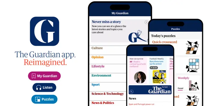
Other publishers are adopting dual-layer navigation in novel ways. In a slightly more radical design choice, The Guardian has added a strikingly visual, editorially curated carousel above its nameplate or flag. The app was relaunched along with a major redesign of its homepage, which Rob Alderson at Design Week described as “mobile-first UX with print-inspired art direction”. Indeed, the app mirrors the newspaper’s print design, which has important stories integrated into the nameplate, and technically, the app delivers Guardian editors a much higher level of design choice. “For the first time, we get a level of art direction across our digital experience that has been the preserve of print,” Guardian Media Group’s executive creative director Alex Breuer told Design Week. As Rob pointed out, it was important to have the homepage design as mobile-first, since 75% of The Guardian’s digital readers use mobile devices. Moreover, the app is a priority because its app users read 15 times more articles than the average web user.
In her piece, Jodie also explored how European publishers have pushed innovation further. One example was the Swiss newspaper NZZ, which redesigned its app’s top navigation to mimic the “stories” format popularised by platforms like Instagram. This update directly addressed two of the takeaways we highlighted in our autumn piece: enhancing content discoverability and incorporating design elements from social media. The result is a “dynamic carousel” that allows NZZ to regularly refresh the content presented to users, making the browsing experience more intuitive, engaging, and visually appealing.
The goal of the dual-level navigation for NZZ, The NYT and the Post was to more easily allow a user to move through the app by splitting out content verticals and features by reducing the friction within the app. However, there are lessons from other apps that publishers should consider to improve the discoverability of content. One key opportunity lies in personalisation, either by using behavioural data to infer a user’s interests based on their interactions, or by prompting users to select their preferences during the onboarding process. Both approaches can help surface more relevant content and deepen engagement. And when it comes to balancing editorial curation with personalisation, most publishers are opting for a balance. As we highlighted with the New York Times, their Today timeline is driven 80% by their editors’ choices, which they see as a core differentiator, and 20% by algorithmic personalisation.
When it comes to delivering content in the app, NZZ’s social-media-inspired top navigation is one option. Alternatively, personalised content can be integrated into a recirculation module within articles, or housed in a dedicated “My News” hub, such as used by The Guardian and BBC News. As for the best strategy, publishers are increasingly adopting a more holistic and balanced approach. This often includes a combination of user-defined personalised news sections, alongside AI-driven recommendation engines that surface relevant content based on behaviour and preferences.
Meanwhile, Germany’s Frankfurter Allgemeine Zeitung (FAZ) has highlighted the value of its subscription offering through a redesign of its premium app, Der Tag. As this isn’t FAZ’s primary news product, the focus was placed on design and user experience to deliver value in a more curated format. FAZ introduced a new navigation element in the bottom right of the screen, freeing up real estate for the content itself. As Jodie noted, this approach carried a significant risk, as it required a change in user behaviour. However, according to another INMA article, the process for designing Der Tag involved extensive user research, including interviews, user tests, and surveys, to ensure the app met reader needs and preferences. Across all four titles INMA examined, the common goal was clear: to improve the user experience, deliver more relevant content, and make it easier for readers to dive deeper into topics that matter to them.
Again, mirroring the New York Times’ You tab at the bottom of their app, The Guardian also has a personalised tab. To personalise the experience, a user must register, adding another step to their unknown-to-known conversion process. We have seen this with other apps, such as The Straits Times in Singapore, where basic personalisation is offered as a feature for registered users. Both apps also promote mobile features that are reserved for premium subscribers. A premium subscription to the app allows access to other features, including an ad-free experience, live news and daily crosswords. Onboarding screens which clearly explain the value of registration and subscription with call-to-action buttons are key to conversion on the first app open.
Our data show many readers skim headlines in the timelines without clicking through articles. Once a reader engages with an article, it creates a crucial opportunity to encourage deeper exploration of the app, helping to build long-term habits and loyalty that ultimately result in retention. Many of the same tools used to enhance discoverability can support this, such as a “My News” hub, which allows users to easily browse multiple articles in a specific content vertical. Additionally, topic-based feeds or curated collections can guide readers toward related content aligned with their interests, encouraging continued engagement.
While passive engagement is valuable, it should be complemented by behavioural nudges that encourage deeper interaction. For example, push notifications can help re-engage users who have become inactive, and habit-forming features such as daily briefings can be enhanced with incentives like reading goals or streaks. Equally important is a well-designed onboarding journey that introduces users to the app’s content and features, ensuring they understand the full value from the start.
We recommend encouraging readers to move beyond text-based articles into more engaging, stickier content formats such as interactive explainers, puzzles, audio, and video. Data from our upcoming State of Mobile Publishing report shows that puzzle and video users have higher 30-day app retention rates than users who read articles or digital editions. Fostering community through commenting and discussion is another powerful way to deepen engagement. Ultimately, by combining thoughtful UX design with personalised recommendations, curated content, and a strategy for delivering behavioural nudges, publishers can maximise user engagement and build stronger, longer-lasting relationships with their audiences.
We’re kicking off day two of the Publisher App Summit (hosted by our friends at Media Voices) this year on Wednesday, 11 June. We’ll be diving into the key findings from our not-yet-published 2025 State of Mobile Publishing report. You don’t want to miss it – let us know if you’re interested in coming along.
UnHerd has unveiled a bold redesign of their Pugpig app, combining a sleek new look with rich features that bring the best of UnHerd’s journalism to readers’ fingertips. Read more here.
Here are some of the most important headlines about the business of news and publishing as well as strategies and tactics in product management, analytics and audience engagement.
Newsletter

Newsletter

Newsletter

Newsletter

Newsletter