News
News
Find out all about the latest product developments and features that have been keeping us busy here at Pugpig HQ, plus what’s on our product roadmap for the year ahead.
22nd November 2023
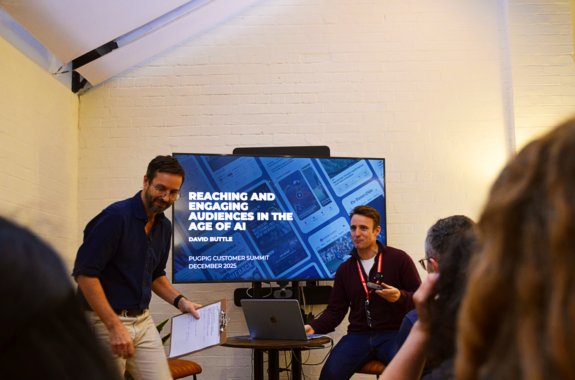
At this year’s Pugpig Customer Summit, we heard from our very own Head of Product, Harry Phillips, who gave some incredible insight into the latest product updates we’ve been spending our time on and what’s to come on our product roadmap.
Along with our core product goals, we then put these roadmap features to the audience to find out which are the most hotly anticipated, and we also took a closer look at some of the most feature-rich apps on our platform.
Jump to:
If you prefer to watch, you can find the video of Harry’s session in full right here or at the bottom of this article.
Let’s start with our core product goals here at Pugpig – why do we do what we do, and how do we decide what we’re doing. We have three key goals that really drive all of our product decisions – everything we do needs to map to one or more of these goals and move one or more of these goals forward. Essentially, these goals should be aligned with what you’re expecting to get out of Pugpig.
1. A delightful, intuitive reading experience that builds affinity between the user and the publisher.
This is the goal that talks to your user, it’s the one where the user is opening your app, having a wonderful experience and coming back again and again.
2. A flexible platform that can be easily tailored to fit our customers’ diverse content and commercial strategies, and empowers them to measure and perfect those models.
We work with lots of different types of publishers with diverse revenue models and content structures. All three of our products, Bolt, Site and Archive, need to be able to fit that all in and work for all of you in a way that’s efficient and effective. The ‘measure’ part of this goal allows our customers to understand how the product is working, and to talk to us to change, improve and constantly iterate on what you’ve got with us at Pugpig.
3. A seamless workflow that allows our customers to organise, edit and distribute their content reliably and easily.
Moving to Pugpig should be easy, it shouldn’t be painful. This goal is about ensuring your editorial teams are enjoying their beautiful workflows and content seamlessly finding its way into your app.
Let’s look at what new features we’ve developed in recent months and are currently working on. We’ll touch upon commercial tools, reading experience, and some things you may not have heard of yet like Pugpig Design Kit and the knowledge base. It’s always worth touching on integrations too as it’s a big part of what we do.
Now let’s take a look back at what we’ve done product-wise over the past year or so. This is a selection of highlights, it’s not exhaustive, but as ever there are a million unsung changes somewhere behind all of this.
Let’s first talk about three highlight commercial features – again lots of our customers have different commercial models and access models and that’s something we only tend to see getting more refined with people trying lots of different things. We have to have a lot of flexibility here and we do a lot of work on this – subscription levels are an example of this.
For a very long time, users were a subscriber or weren’t a subscriber. Now, we support lots of in-app subscription levels from basic subscribers and basic plus subscribers to premium subscribers and premium ad-free subscribers for example, all at once.
And we support that through in-app purchases and through third party auths – you can even create a nice in-app UI to show users the benefits you get from one subscription type and not from the other. It’s built straight into our subscription flow so it’s exactly the same way users used to go and buy a subscription, but they now have a choice of what subscriptions they’re going to buy.
That’s the super lovely name for the super lovely feature that Apple gave us from the goodness of their hearts (read: the law). We’ve implemented External Link Entitlement and it’s iOS compliant so far – we don’t think we’re ever going to be fully confident telling you ‘Apple will 100% accept this’.
It’s both the most defined thing they’ve done and the most opaque thing they’ve done where they’re very strict about what your links look like (blue and underlined) but they are very vague as to whether it’ll be okay if you’ve had in-app purchases in the past, for example.
So far, we’ve had a few customers go live with this which you can read about here, and we’ve had no issues so far. For us, it’s not a huge amount of work as most of this happens off-platform. We trigger the in-app screen which then takes your user through where they can complete their purchase off-platform.
We should also mention there is a Google version of this which is available as of now, called User Choice Billing. It’s essentially the opposite of Apple’s in that you have to have in-app purchases and Google still takes most of your money, so it doesn’t seem the most tempting thing. We haven’t implemented this just yet but if you’ve got thoughts or ideas please get in touch!
While those first two commercial tools focus on subscriptions, we do still have a pretty fair number of ad-funded titles, or a bit of both actually in some cases. Google Ad Manager has always been the provider we use because it’s what almost all of our customers use. Recent developments here cover adaptive banners, targeting and ad placements.
First, we’ve moved to adaptive banners meaning there are now a few more sizes available. Next, we’re continually growing and constantly working on our ad targeting – some of our customers have incredibly mature, complex set ups in Google Ad Manager that we are now able to support at the Bolt level. And finally, we now support a few new ad placements for you to put some ads should you want to, and that’s all beautifully documented here.
Bolt is as much our editions solution as it is our breaking news solution, and so we’ve added some nice features to help users more easily navigate through editions.
Some users, as we know, just read the news or the finance section for example and nothing in between, and so forcing them to swipe through the entire edition wasn’t ideal. This new feature gives them a nice way to quickly whoosh through and find the sections they care about.
Offline, on the face of it, always seems straightforward and the goal of it easy to state, ie. you want users to have everything offline they want to have offline. Achieving that is challenging, and it’s probably the thing we’ve put some of the most of our thought into over the last few months.
We’ve done a lot of work towards it and we still have things to do around Bolt offline behaviour, concentrating on trying to find that balance between giving the end user content offline and not exploding their data use, your data use, or their battery life.
One way to do that is by giving our customer – the publisher – more control to decide whether they want all images to be offline or only some, for example. There’s some more underlying work we need to do around downloading in the background and when exactly that happens, so there’s a lot of time and effort going into this currently.
It’s certainly not solved across the internet and you’ll probably see it all the time in other publishing apps not built by Pugpig – the end game is obvious and getting there is very, very challenging. It’s a good job we like a challenge!
For context, Pugpig Publish which is our old digital editions programme, downloaded everything and worked offline for years and years and years.
The reason this is something we’ve been noodling over more recently is that Pugpig Bolt always used to be the live product, and so it’s a very different sort of behaviour, in the same way that Instagram offline is pretty awful.
It’s just a constant balance of user experience while you’re online, bandwidth, and user experience when you’re offline. So to download a digital edition is easy – you just hit a button.
But to download timelines and articles within timelines, and images within articles within timelines in a way which is both not annoying and also useful is actually quite a hard problem to solve.
Jonny
Pugpig Design Kit is a new easy-to-use, powerful tool for visualising your app and content layouts before starting development. Earlier this year we hired our very first UX Designer and Pugpig Design Kit was born soon after.
For a lot of these big juicy projects we work on, there’s the initial phase where the customer has their designs and we’re ready to start building their app on Bolt. Merging those two together used to be a lot of talking back and forth, so the Pugpig Design Kit is a sort of a hybrid between documentation and prototype.
It’s essentially the entirety of Bolt existing in Figma (the collaborative interface design tool). Customers each get their own Figma file which has all of our rules pre-built into it. They can then start to lay out their timelines, choose their tabs that’ll go across the bottom of the app, see how things are looking and get a really great sense of what’s possible and what Bolt is capable of without having to go back and forth. So not only is this reducing time to launch, it’s also much better for setting expectations both ways.
Pugpig Design Kit is complete and ready for all customers to have a go with. If you’d like your own design kit, just have to reach out to your Customer Success Manager or support who’ll get you set up so you can start designing away within the limitations of Bolt.
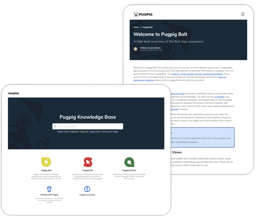
Our product is massive with lots of corners. We’ve finally written them all down (well, we’ve written as many as we can and we’re still going!) in our brand new Knowledge Base. We now have a brand new tool called Helpjuice to host our knowledge base, a free-to-access source of information about our product’s features and capabilities.
It’s always a company-wide effort to document everything, and so if you’re looking for answers or just want to learn more about Bolt’s capabilities, we’d always recommend visiting our knowledge base and searching for things. It has built-in feedback capabilities, so if you can’t find anything, there’s a button to say ‘I can’t find this’, or if you find an article is not quite right, you can comment on it there and then and we’ll fix it.
Our knowledge base is wonderful. It’s constantly growing and constantly being monitored and we’d recommend taking a look if you haven’t already.
We’re now working with even more amazing partners and platforms. Let’s dive into a few key product-supported integrations we’ve recently added to the platform and their capabilities.
Airship is one of our messaging solution partners. It’s been one of our integrations for years now and as such, we have a lot of customers using it. We’ve recently upped our integration capabilities a little more, so we now have preference centre and message centre functionalities, and there’ll be lots more additions from Airship in the future, so watch this space.
Viafoura is all about commenting and community, and they’re a pretty big, pretty feature-complete player. We currently have a few customers live on that and we have more to do there as well.
OneTrust is an integration for consent tracking analytics. From our point of view, OneTrust is a world leader in consent solutions supported at the product level. In your app, OneTrust turns things on and off for you. You can decide and we give you the tools to do it.
OneSignal is the mid-player on the push notifications spectrum, offering a happy medium in terms of feature set and pricing.
Chartbeat provides publisher-focused analytics. It’s a real-time focused analytics tool, so it’s more about what are people reading right now and what’s big right now rather than what your users are doing this month.
Here at Pugpig we’ve got a very big, detailed, wonderful analytics specification which many of you know. We track lots of events, lots of dimensions and sometimes our customers want them to have different names. That was one of the very, very few downsides of the platform, where changing that for one person is challenging. Not anymore!
GTM allows you to have your own names for events and parameters which you can go and change as you wish and drop any you don’t want, giving you that little bit more flexibility for GA4. Get in touch with support if you’d like more information.
We have lots of customers using our Piano integration and we’ve recently added support for experiences on the timeline. There’s a little block at the top of your app that knows if your user is signed in, not signed, or signed in as a specific type of user.
Controlled via the Composer in your Piano dashboard, you can show messaging based on all of that rich data on the user’s state and entitlements. Currently, we’ve got passwordless login and social sign in and we have more to do around metering and content recommendations. Piano is a big, sprawling company with a lot of cool capabilities that we’re definitely thinking more about.
First up, Pugpig Archive. Everything else at Pugpig we’ve either built ourselves or is via an integration with one of our partners, but we bought Archive back in the summer of 2022 – a best in class solution for back catalogues which is now part of the Pugpig product suite. With Archive, content can be read in its original format or remastered for the web.
When we bought Archive (formerly known as Bondi), it was a mature product and largely feature complete, so the work for us centred around moving it onto our much more modern architecture to enable us to roll Archives out, launch them quickly and iterate upon them much more easily.
More recently, our work on Archive has covered integrations and authentication amongst other things – making it easier to add different kinds of advertising, for example.
Regarding authentication, essentially how your users get access to thing: it’s one of the things we spend a lot of time on at Pugpig. We want to make sure that’s easy, that our customers can tie into the systems they’ve already chosen and not be forced to move somewhere else.
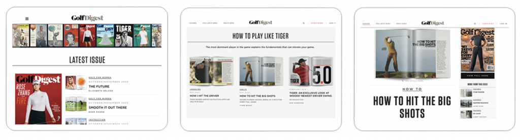
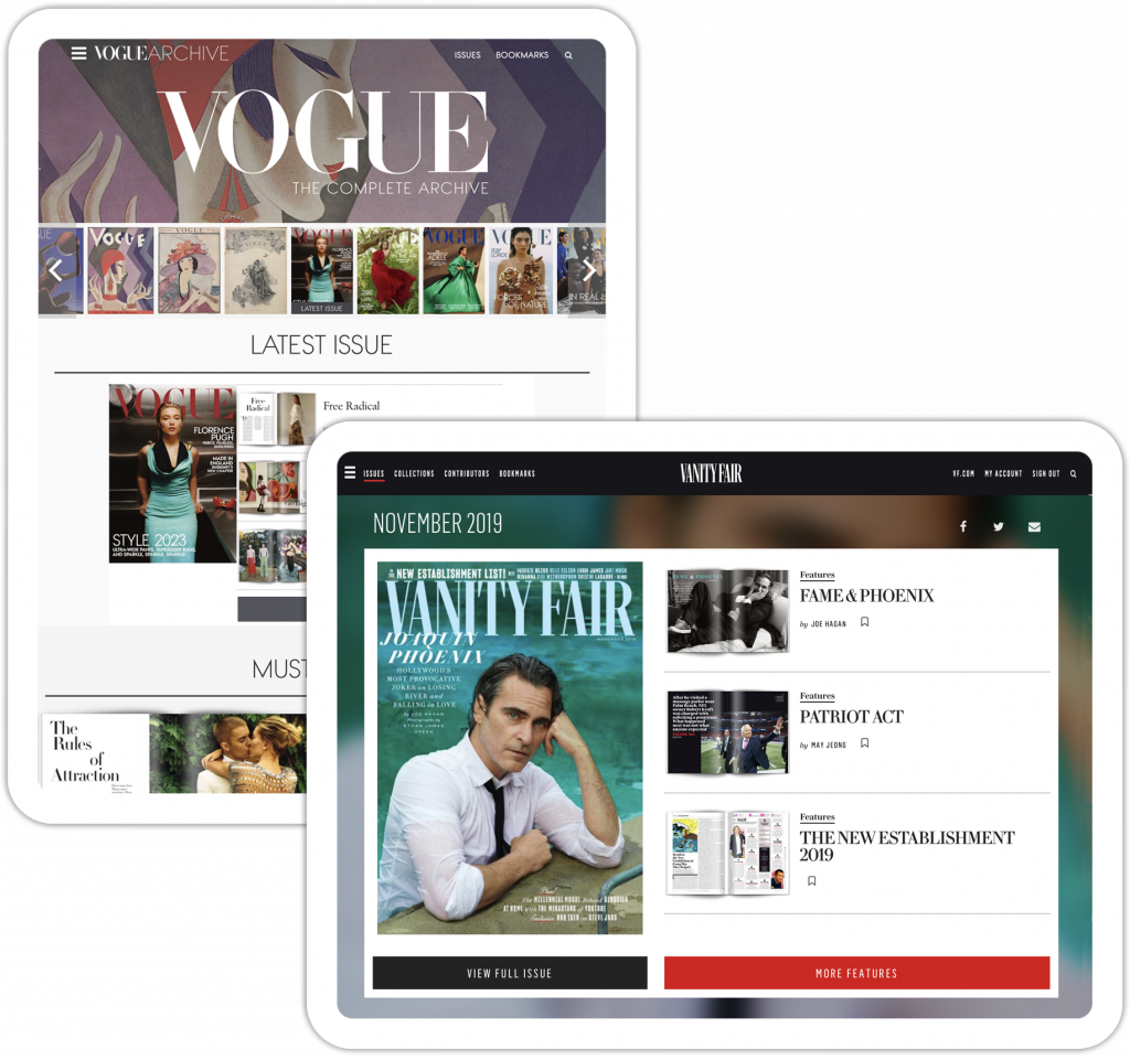
Let’s take a quick look at the Golf Digest archive. This is a publication that’s been publishing since 1950, and so while there is arguably dubious value in reading golf tips from the 1950s, they are still available to read as well as lots of fab content Golf Digest, understandably, doesn’t want to languish and disappear.
As you can see, we’ve got this lovely latest issue section (image one) which is beautifully laid out – and this reiterates the fact that archives are still a place to go and read the latest content if you want to, it’s not solely to go and see old content.
You’ll also see they’ve got this ability to pull content from different editions over a common theme (image two). In this instance they’ve used ‘Tiger Woods’ and pulled articles from 2007, 2007, and 2018, so that’s three different pieces of content from three different editions all pulled together and highlighted there really nicely into a collection.
If we go into one of these collections, you’ve again got a really nicely designed content view and a choice between reading it in the HTML version or in its original form as a PDF (image 3).
Archive also has wonderful search and it’s very nicely structured – you can search for author names, edition dates, article keywords and more to dive straight into an article or edition. For customers who have all their digitisation done already, it’s really not a heavy lift to get set up on Archive – we have a seamless process where you FTP your PDFs and we spend some time styling them. Get in touch if you’d like a demo.
If you take a look at some other titles currently on Archive, such as Vogue, Creem, Architectural Digest or Aviation Week, you’ll see Archive isn’t wildly customisable like Bolt, but it’s a really great content view and an easy way to give historical content a new lease on life.
Pugpig Site brings the best of Pugpig to websites: WordPress knowledge, publishing expertise, and rock-solid infrastructure. Three things we’ve had for a very long time and are what we’ve built Bolt, our app product on. We’ve been doing Pugpig Site for a couple of years now, and that underlying tech allows our wonderful services teams to build a beautifully responsive 2023 website for our customers.
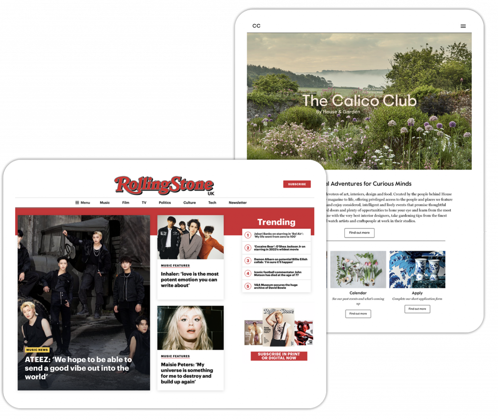
We’ve rolled out quite a few of these recently – Attitude, Rolling Stone, and The New European are very nice examples you should definitely check out.
There are tons of other new features and improvements that we’ve done to Bolt over the past twelve months or so, let’s take a quick look at some of the most interesting ones.
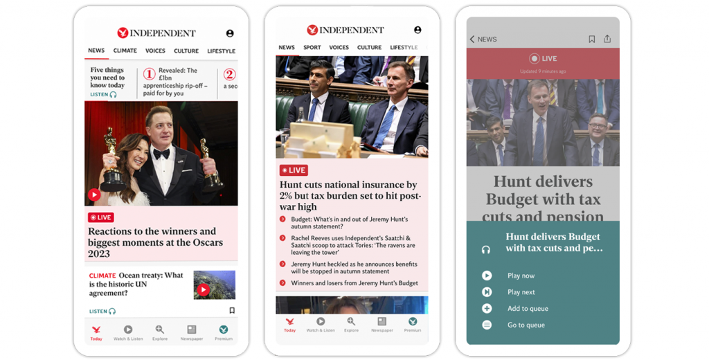
Firstly, The Independent – a wonderful big, breaking news type of publication. You’ve got your five things you need to know across the top with a sideways scroll for a slightly different way of presenting five smaller stories. The app really does have a lovely content view, you’ll see live articles too which are live, updated and in a continual state keeping users up-to-date and in touch.
You’ve also got the listen button there within each article. These guys are using our Amazon Polly plugin, which is Bolt’s out-of-the-box solution. The Independent is a nice example of having that nice big listen button right there to give users the choice of having the whole article read to them instead of having to read it.
Download the app on iOS or Android to take a closer look at some of the features and functionalities.
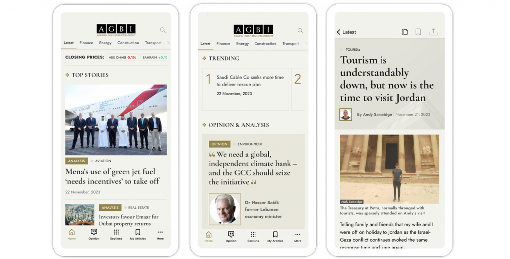
AGBI is a very sleek app that we launched very recently. Other than the fact it looks great, there are a couple of cool features worth talking about here. Both on the timeline and in content we’ve got closing prices across the top of the app, which is done through Bolt’s ability to bring custom HTML elements from our customers into the app.
This app also uses really lovely layouts and dynamic timelines – they’ve got the editions scrubber at the top and users can scroll through sections at the bottom. The ‘trending’ section of the home feed is another nice example of the side scroller functionality, and just below this on the home feed you’ll see how the timeline can be broken up into lots of different sections which looks very appealing, rather than just a stream of content.
Download the app on iOS or Android to take a closer look at some of the features and functionalities.
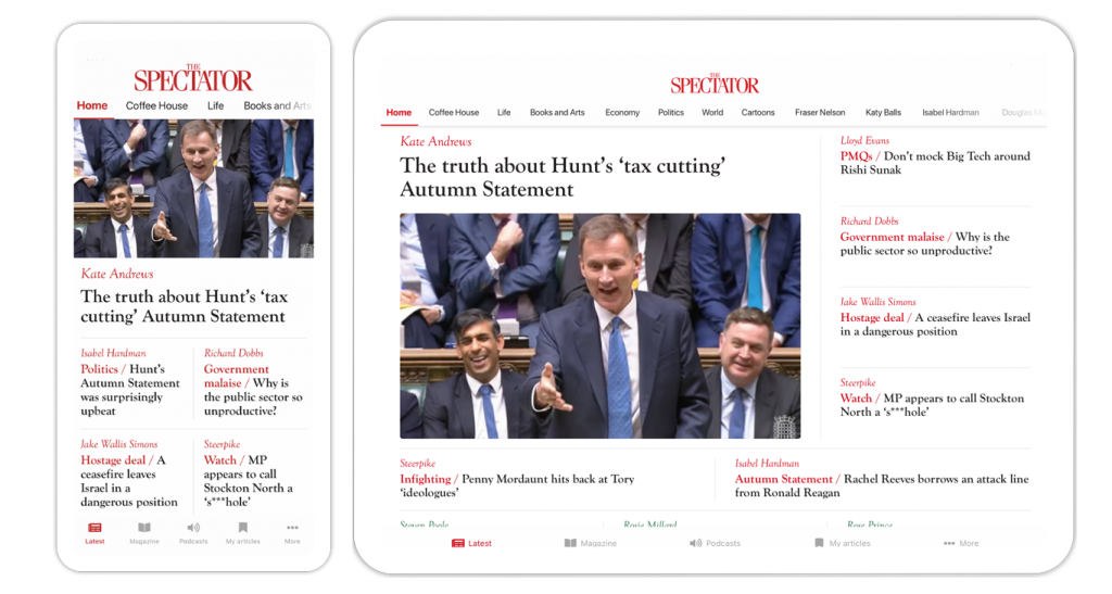
When we started Pugpig, we were very tablet-centric, it’s fair to say. Probably a few years into our life mobile became the ‘thing’ and everything was mobile first – Bolt in particular became a mobile first product. As such, the user experience is very much focused on a single column, scrolling stack of cards, as you know. This is everything you see and everything you’ve always seen with public apps.
The Spectator in particular pushed us a little bit because, for their audience, the tablet is a really important platform. For a couple of years with Bolt, all we did was the same as what Instagram and various other apps do on tablet – make the columns a tiny bit wider and have gutters on either side. Not ideal.
Using our new timeline layouts plugin which we’ll talk a little bit more about further down, The Spectator app now has a brilliant, dynamic timeline layout that works beautifully across both mobile and tablet.
When opened on a tablet, the app uses the same timelines as the mobile app as a single scrolling column that The Spectator wanted to fill the screen to have something that is far more suited to the device in both landscape and portrait views.
The Spectator gave us an almost pixel-perfect design for us to work off which was really helpful, and we’ve now built a more generic version of that as our off-the-shelf basic timeline grid layout which works for different screen sizes. For anyone that has an iPad audience, this is a really important feature.
Download the app on iOS or Android or check out The Spectator case study to take a closer look at some of the features and functionalities.
Now we’re going to talk about all the features and improvements you haven’t seen yet but are coming in the future. Let’s talk through four key things that are on our product roadmap – some of these are already in some level of development and some aren’t. Some we’ve been thinking about for years and are finally nearing the cusp of getting into development.
As mentioned in The Spectator overview, this is a whole new tool that comes with a whole new set of capabilities to completely control the layout of content on the timeline. For example, you could have a breaking news block that pulls in the top three stories from across the app and displays them beautifully in a block with a specially designed background. With timeline layouts, you can do all this plus automatically hide blocks that aren’t relevant, ie. if there is no breaking news.
Timeline layouts gives you the same sort of ability you would get if you’re building, say, a desktop homepage for a massive publisher. You can do that in your content timelines just as easily while having ultimate control to structure your content as you want in your CMS.
This means you can make your content look much more beautiful across phone, tablet, and desktop, so it’s a huge visual lift and also gives you much, much greater control over the flexibility of what your content looks like.
This one’s been on the list for so long and used to be called ‘Saved Dynamic Timelines’. To give you a little more context on that, at the end of app content you might have a little lozenge that says who the author is. If you tap on that, you can see a bunch of content by that author. This is a feature we all know.
But then, let’s say you want to find that again the next time you’re back in the app. Before, you’d have to find an article from that author and find the lozenge at the end of the content.
With this coming product improvement, no more lozenge-finding is needed! Bolt now allows you to save those timelines, and they’ll be top class citizens that sit right up in your top nav bars next to all your other timelines. Essentially, it’s your editorial curated content right next to the content the user has chosen that matters to them.
It’s super easy to manage, there’ll be a UI where you can add, choose, find, reorder and give that extra layer of personalisation making it much easier to bring the content your users really care about to the front of their app. To summarise, this is a big one we’ve wanted to do for really long and is now in development.
This is one that, on paper, seems so simple and another one that we’ve thought about for such a long time. It’s essentially timelines within timelines in the form of an extra level on your app’s navigation. As we work with more and more publishers with more and more needs, some of them have such huge content trees that it became a relatively good need for us to build and offer second level navs.
We’ve always had the beautiful picker at the top of the app where users can simply swipe across and pick the topic they want. You can now optionally have a second layer, so for example, you could break down your sports section into football, synchronised swimming, or whatever other subtopics make sense.
Customers with us since the Pugpig Publish days will remember something called ‘promo slots’. Storefront marketing messaging is essentially promo slots reborn and resurrected as something entirely new, offering the ability to put whatever messaging you’d like on the storefront based on that rich understanding of your user’s state.
In a similar way to what we achieved with the Piano experiences card mentioned earlier, you can send messages, subscription offers, the latest edition, for example to users based on whether they’re signed in or not and what entitlements they have. It’s essentially a new messaging functionality built right into the storefront.
A small note on something else we do keep talking about is around newspapers where we don’t like the PDF view but the pure HTML view might slightly miss that sense of serendipity, placement on page and the concept of section pages and front pages, and so on.
Taking that concept and, rather than in a timeline view, envisage that as the front page of a digital edition. When you go into a storefront, tap to download the edition, up pops something that looks like a timeline, but it’s your front page or a section page of your edition.
That’s a feature that takes the tech of the timeline layouts feature and applies it in a slightly different use case and is one we’ve been discussing recently.
Going back to roadmap features we discussed earlier, we put these to our audience to rank them in order of which they were most interested in. Our customers at the summit ranked them in the following order:
When it came to voting on our core product goals, our customers ranked them in the following order from most interesting to least:
This is really useful insight for us as we think about and prioritise our roadmap and product goals. For the final vote, we looked at which metrics are most important for our customers when looking at the success of their app. The metrics were ranked in the following order:
To summarise, our product has a lot to it and there’s a lot we want to do with it. If you’re interested in anything mentioned in this article, please do get in touch or book a demo. We hope to see you at next year’s Customer Summit!
Watch Harry’s full talk below.
News
News
News
News
News